 React Native
View Component in React Native
In this article, we will learn about the View component in React Native.
Total Views: 1332
In this article, we will learn about the View component in React Native. The View component is one of the most fundamental components for building UIs in React Native. A View is a container that supports layout with Flexbox, styling, touch handling, and accessibility control. It is similar to the <div> element in HTML used for web development, but it is optimized for mobile applications.
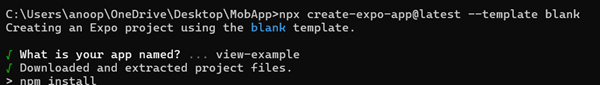
Let’s create a new React Native project with a blank template using the command below:
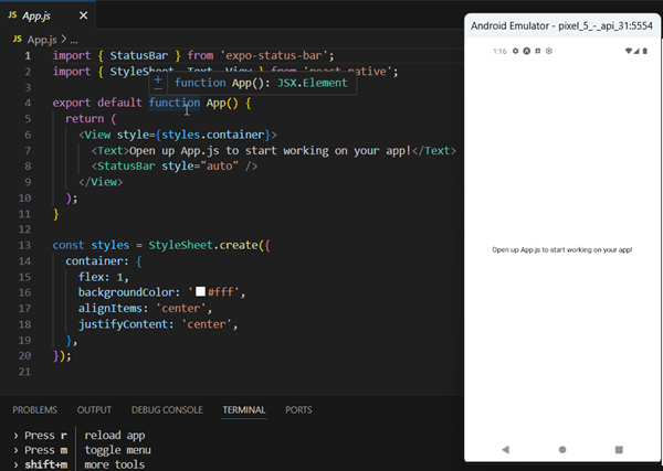
Once the project is ready, run the npm start command in the terminal. Since I already have Android Studio installed on my system, I will run the application on the Android Virtual Machine.
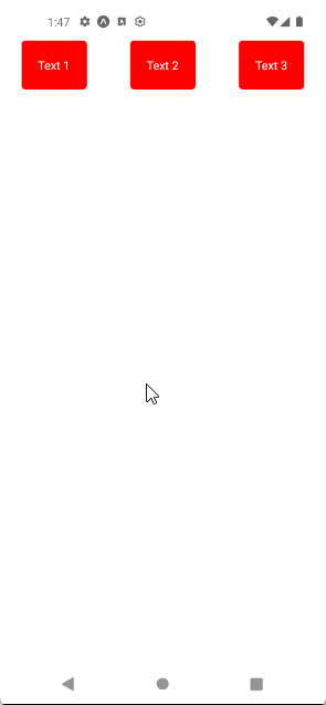
In the first example, let’s arrange the three child Views in horizontal rows. For that, I have created container and box styles, where the container style has flexDirection set to row, which arranges the child elements in a horizontal row, and the box style sets a red background with white text color, and rounded corners.
import { StyleSheet, Text, View } from 'react-native';

export default function App() {
  return (
    <View style={styles.container}>
      <View><Text style={styles.box}>Text 1</Text></View>
      <View><Text style={styles.box}>Text 2</Text></View>
      <View><Text style={styles.box}>Text 3</Text></View>
    </View>
  );
}

const styles = StyleSheet.create({
  container: { flexDirection: 'row', justifyContent: 'space-around', paddingTop: 50 },
  box: { backgroundColor: 'red', padding: 20, borderRadius: 5, color: 'white' }
});Preview:
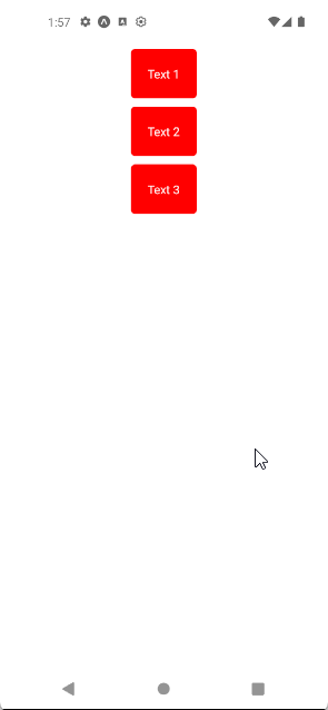
Let’s change the container’s flexDirection to column, which will arrange the child View component in a vertical column
import { StyleSheet, Text, View } from 'react-native';

export default function App() {
  return (
    <View style={styles.container}>
      <View><Text style={styles.box}>Text 1</Text></View>
      <View><Text style={styles.box}>Text 2</Text></View>
      <View><Text style={styles.box}>Text 3</Text></View>
    </View>
  );
}

const styles = StyleSheet.create({
  container: {
    flexDirection: 'column',
    alignItems:'center',
    paddingTop: 50,
    paddingLeft: 10,
    paddingRight: 10
  },
  box: {
    backgroundColor: 'red',
    padding: 20,
    borderRadius: 5,
    color: 'white',
    marginTop: 10
  }
});Preview:
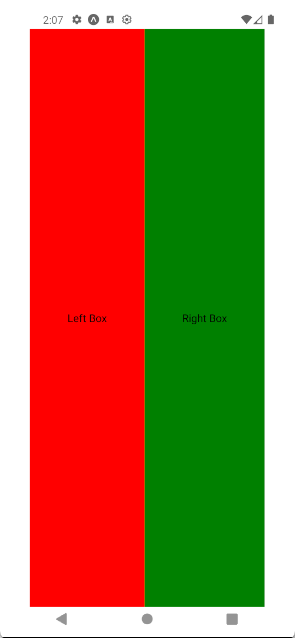
Let’s try another example in which we will see how to create a two-column layout. For that, we will set flexDirection to row, which will arrange the child View side by side. In box style, the flex property with a value of 1 ensures that each box takes equal space. I have also added leftBox and rightBox styles with backgroundColor set to red and green, respectively, to easily distinguish between left and right view.
import { StyleSheet, Text, View } from 'react-native';

export default function App() {
  return (
    <View style={styles.container}>
      <View style={[styles.box, styles.leftBox]}><Text>Left Box</Text></View>
      <View style={[styles.box, styles.rightBox]}><Text>Right Box</Text></View>
    </View>
  );
}

const styles = StyleSheet.create({
  container: {
    flex: 1,
    flexDirection: 'row',
    padding: 40
  },
  box: {
    flex: 1,
    justifyContent: 'center',
    alignItems: 'center'
  },
  leftBox: {
    backgroundColor: 'red'
  },
  rightBox: {
    backgroundColor: 'green'
  }
});Preview:
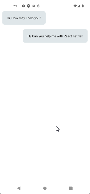
We can also create a small chat-application-like interface. Here, we use alignSelf as “flex-start”, which aligns a message to the left (like a message received from user) and “flex-end” aligns a message to the right (like a sent message). The maxWidth property is used to control the maximum width of the View component.
import { StyleSheet, Text, View } from 'react-native';

export default function App() {
  return (
    <View style={{paddingTop:40}}>
      <View style={{backgroundColor:'#dfe6e9',padding:20,margin:10,maxWidth:'75%',borderRadius:10, alignSelf:'flex-start'}}>
        <Text>Hi, How may I help you?</Text>
      </View>
      <View style={{backgroundColor:'#dfe6e9',padding:20,margin:10,maxWidth:'75%',borderRadius:10, alignSelf:'flex-end'}}>
        <Text>Hi, Can you help me with React native?</Text>
      </View>
    </View>
  );
}Preview: